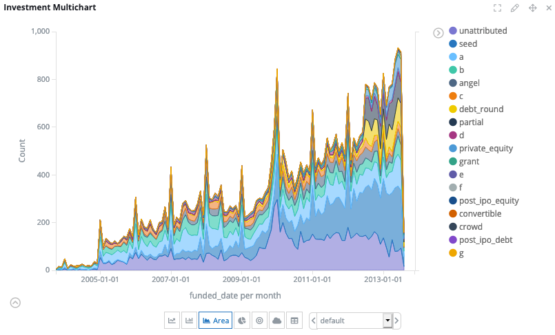
Multichart
The Multichart visualization displays a combination of different types of chart. You can use the Multichart to switch between charts with the same aggregations.
The types of chart that can be displayed are:
-
Line
-
Bar
-
Area
-
Pie
-
Bubble
-
Tag cloud
-
Table

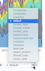
When the Multichart is in the dashboard, you can select from the other available configurations either by clicking the dropdown menu or by clicking the left and right navigation buttons.

You can also enable or disable the following options by clicking the cog icon:
-
Type selector: The button bar where you can select the chart type.
-
Dropdown menu: The box where you can select the aggregation configuration.
-
Menu navigation buttons: The navigation buttons around the dropdown menu.
Configuring a Multichart
When you are creating a Multichart visualization, you can either accept the configuration that is pinned by default or you can click Get default configurations to return all of the fields from the data set.
From the list of configurations, you can select a different one to pin as the default and you can edit or remove others.
Select the configuration that you want to display in the chart and add metrics or sub-buckets as required.
The metrics and buckets are similar to those that you would select in an Area, Bar or Line Chart. For more information, see Configuring area, bar, and line charts.
After you have configured the Multichart, click Apply changes and Save.