Creating dashboards
|
The actions described in this section, and the associated context menu options, are only visible to users who have the relevant permissions.
For more information about ACL permissions and access levels, see
saved object permissions
and
access control app
(for the default |
When you first log into Siren Investigate, the Dashboard app is open showing the first available dashboard or, if no dashboards are defined, the dashboard creation screen.
|
You can return to the Dashboard app from anywhere in the UI either by selecting it in the Menu bar or by clicking the Siren Investigate logo. |
Procedure
-
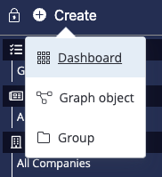
On top of the sidebar, click Create → Dashboard.

-
Give the dashboard a name and click Create. The dashboard is created but it is empty.
To start building the dashboard, you must add visualizations to it. You can do this manually or by auto-generating the dashboard.
Auto-generating dashboards
An alternative way of creating a dashboard that is based on an entity table or search is to auto-generate it based on a set of important fields.
An auto-generated dashboard contains some sample visualizations that can get you started with your first analysis.
Procedure
-
Go to the Data model app.
-
Select the entity table or search that you want the dashboard to derive data from.
-
On the Data tab, click Discover most relevant fields. This function selects the top 10 fields in the data set. You can increase or decrease the number of fields that are selected.
If any fields are already selected, the Discover most relevant fields button is not available.
-
In the Autoselect Top 10 dialog, you can accept the system’s selections or make changes.
-
Click Select. The list of selected fields is now populated.
-
Click Generate dashboard. The following options are available:
-
Store time with dashboard: Select this option to retain a specific time range the first time the dashboard is opened in a new session. If this option is deselected, the default time range will be applied, which is stored in the
timepicker:timeDefaultsparameter in Management → Advanced Settings.You can adjust the time range by setting a Time filter at any point during an analysis. If you do not save the dashboard with the new time filter applied, it will return to its last saved state when you open a new session.
-
Add Related Dashboards visualization: This option adds a Relational Navigator visualization, which allows you to navigate to other dashboards that contain related data.
-
Add Multichart visualization: This option adds a useful Multichart visualization, which allows you to select from different types of charts within one visualization. This option is not selected by default, because it can cause the dashboard generation process to be slow.
-
-
Click Generate. The Generate a prepopulated dashboard dialog opens, displaying the type of visualization that will be generated for each of the selected fields.
-
(Optional) In the Chart type column, you can select other types of visualization where a dropdown menu is available. And in the Vis Name column, you can modify the names for the visualizations. Otherwise, you can accept the default values.
-
Click Create the dashboard. The new dashboard appears in the Dashboard app.
In the Dashboard menu, you can drag and drop the dashboard into an existing group.